The Power Of UI
User Interface (UI), not to be confused with User Experience (UX), though both are vital to website usability, is one…
With the popularity increasing at a fast pace of people conducting business online, the tables have suddenly turned in recent years. It is now a requirement for your website to be user-friendly in order for your business to be successful. We have accumulated helpful tips to help you make your website user-friendly which will inevitably equate to more visitors.
In this technological day-of-age, it is incredibly important for your website to be user-friendly. More and more people are using their mobile phones to access the Internet; it is a necessity for your website to work across all platforms. It is easy for you to check whether your website works across mobiles by using the Google mobile site tester. If your website does not display in a pleasant, easy and clear way on mobile, then you can create a mobile version of your website free of charge with the help of web-based mobile website builders.
It is very important for your website to have a logo on it. It is clear through researching other websites and browsing online that it is best to place your logo in the top left. As the English language reads left to right, this is where visitors eyes will first land. If your logo is not prominent on your site, this won’t only confuse potential customers who may think they’ve landed on the wrong page, but you are also missing a brilliant branding opportunity.
As previously highlighted, the amount of time people spend on the Internet is forcefully on the increase…and the popularity of social media has exceeded all expectations. Social media is a great way to interact with your audience and it is also excellent for communicating with fellow industry leaders and influencers… it will increase your brand recognition! When you stop seeing social media as a way to pitch your customers and start seeing it as a way to connect with them, it can transform your brand.
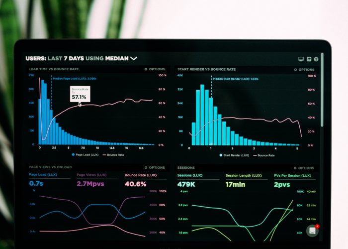
Through research, it is clear that if your website does not load in 3 seconds or less, you are going to lose visitors. A study conducted by DoubleClick – Google concluded that “53% of mobile site visits were abandoned if a page took longer than 3 seconds to load” and also discovered that “sites loading within 5 seconds had 70% longer sessions, 35% lower bounce rates, and 25% higher ad viewability than sites taking nearly four times longer at 19 seconds”.
Functionality on a website is key. Sometimes, even the savviest of website users cannot find what they’re looking for and these particular individuals expect your site to have search functionality. If this isn’t the case on your website, they will most likely leave your site and find one that is easier to ‘move around’ on.
People like to skim-read. Today’s visitors of websites are reading less and are expecting more visual aesthetics such as photos and videos. However, the entirety of your website should not just have visuals. You need to find balance between text and images and not go too far either way. Another tip to highlight is how important it is to have high quality visuals. Pixelated and low quality images gives the impression of unprofessionality. It also helps to use real photos whenever possible.
Even though something on your site may be clear to you, that doesn’t necessarily mean that it is clear to all visitors. Sometimes, potential customers need subtly reminding and helpfully pushed in the direction of what you, as a business owner, wants them to do on a certain site page. An example of clear call-to-actions are:
Frequently on websites there will be a contact page which allows a visitor to talk to the company in confidence and hopefully gain more information than what’s already on the site. Contact information is also commonly included in the footer which enables the potential customer to view the details on every page clicked on. Providing your contact information builds trust between you and a visitor and therefore encourages the individual to get in contact. You end goal for supplying contact information is to engage with customers and allow them to contact you at the click of a button.
I hope our tips on how to make your website user-friendly helped you and aided you in you knowledge regarding this matter. Here at Hex, we cannot emphasise enough how important this is and it will benefit your website enormously!

User Interface (UI), not to be confused with User Experience (UX), though both are vital to website usability, is one…

When it comes to design, specifically web design, it can be difficult to decide what success looks like. The best…

The internet is a crowded market place and half the battle is ensuring your target customers can find your eCommerce…